


Federal Website Redesign: Federal Communications Commission
Overview
Users of the government agency's communication website have expressed frustration while attempting to file complaints, apply for "Do Not Call" lists, or obtain licenses for upcoming business ventures. Our team is diligently working to enhance the site's user-friendliness and streamline the information required on its main pages.
My Role
-
User research
-
User interviewer
-
Sketching and Wireframing
-
UI Design
-
Low-Fidelity prototype using Figma
-
High-Fidelity prototype using Figma
-
User testing
Platform
Desktop version
Timeline
5-weeks
Problem, Solution & Impact
Problem
The Federal Communication Commission (FCC) users have felt overwhelming information on the website, and the users cannot quickly navigate to find the needed information.
Solution
Offer access to a platform that streamlines tasks, eliminating paperwork. We also offer support during the initial months to help users adjust and move forward.
Impact
Redesigning the website to make it easier for users to navigate quickly will make their lives easier.
How Might We?
How can we redesign the FCC website to help consumers find what they need while maintaining major communication categories?
User Research
I began researching by visiting the FCC website to comprehend its categorization and content. Once I made my notes for reference, I wanted to know what the users felt- so I sent out a Google Survey with about 15 questions to see if and how easily users would like to navigate through.
Hypothesis
The user would launch and expand a new affordable cable company, giving families a competitive advantage over other providers.
Methodology
Google Survey was sent to our peers and family members, and based on our findings, many users were overwhelmed looking at the content on the website. Users had expressed that it would have been better if either was a consumer category only and communications content was separated.
Interviews
We took the potential interviewers from the survey and set up Zoom call interviews to understand users' challenges while navigating the FCC website.

To our interview findings:
1. 75% of them were overwhelmed by the categories and subcategories.
2. 60% of them found it challenging to find the contact information.
3. 80% of them were confused about where the contact FCC form was, along with other issues such as finding maps and other concerns.
Affinity Diagram
We analyzed the interview responses and feedback we received during our research by grouping similar ideas and themes using an affinity diagram. This helped us draw insightful conclusions and make informed decisions.

Empathy Map
Looking at our findings, we started mapping the responses to develop knowledge about what your users do, say, think, and feel.

Definition & Synthesis
Once the information was gathered from the Research, we started combining all the research, observing your users’ needs, and highlighting opportunities for innovation. This step was followed by thinking about the user, and we developed the User Insight.
User Insight
Users are struggling to navigate the FCC website to find necessary information and need a simpler solution to complete their tasks.
User Persona
Considering our user insights and interview findings, we built a user persona to understand our users' pain points and frustrations.

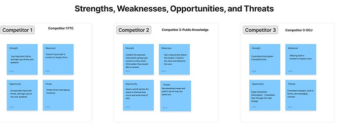
Competitor Analysis
To better understand the landscape of similar websites, we researched compatible websites to analyze what they offer and identify opportunities for us to exceed their capabilities. During this process, we categorized our competitors into Direct and Indirect categories. However, as this is a Federal website, we noted that there are no direct competitors for the FCC. Nonetheless, we found a few websites that work similarly to the FCC's.

We conducted a competitive analysis of various organizations, focusing on their structure and website features. The organizations analyzed include the Federal Communications Commission (FCC), the Federal Trade Commission (FTC), the Department of Justice (DOJ), and Public Knowledge.
-
FCC and FTC are major regulatory bodies.
-
Public Knowledge is an organization that works in the public interest.
-
DOJ is a governmental organization responsible for law enforcement.
-
Key website features studied include easy navigation, contact form availability, website font, and color scheme.
Heuristic Evaluation
Upon conducting a comprehensive heuristic evaluation of the Federal Communications Commission (FCC) website's desktop and mobile versions, I have identified several noteworthy concerns with the existing site. The primary issue pertains to an overabundance of written content, which may overwhelm users, hindering their ability to navigate the website effectively. Additionally, the absence of a help button could further aggravate the situation, as users may require assistance when faced with navigation difficulties. Lastly, the placement of elements, such as text and images, appears to lack a deliberate and structured layout on the page, which may contribute to a suboptimal user experience. These concerns may impede the overall effectiveness of the FCC website and may hinder users from accessing the information and resources they require.


Ideation
We revisited our notes and compared the pain points and frustrations we noted earlier. We used this information to develop an Ideation plan for our travel app. The plan includes what users like, wish for, and any "what if" scenarios they may have.

Upon reviewing the feedback, I was able to group it. This helped me identify the must-haves for our users.

Value Proposition
The FCC website has been revamped and optimized to provide a seamless user experience. With the new design, users can easily navigate the website and find the information they need quickly and efficiently.they need swiftly and without any hassle.
User Journey
We grouped the feedback to reflect the users' preferences and desires. I used the user persona to create a journey map for the phase intersecting with my product scope. I divided the user’s journey into stages and mapped the touchpoints. I tried finding opportunities for each stage through the users' feelings, thoughts, and activities.

User Flow
We created user and site flows, tested with peers and made necessary changes.

Wireframes
Now the user flow was set and tested, it was time to make the desktop and mobile paper sketches.


We transferred the sketches to Figma to make digital desktop and phone wireframes.


Followed by desiging the mobile version of the website.

We were able to prototype our wireframes and test them out. During this process, we went back to checking FCC's competitor websites to compare colors and typography.
UI Style Guide
After comparing the other federal websites for colors and the layout, we decided to keep color blue as the dominant color.

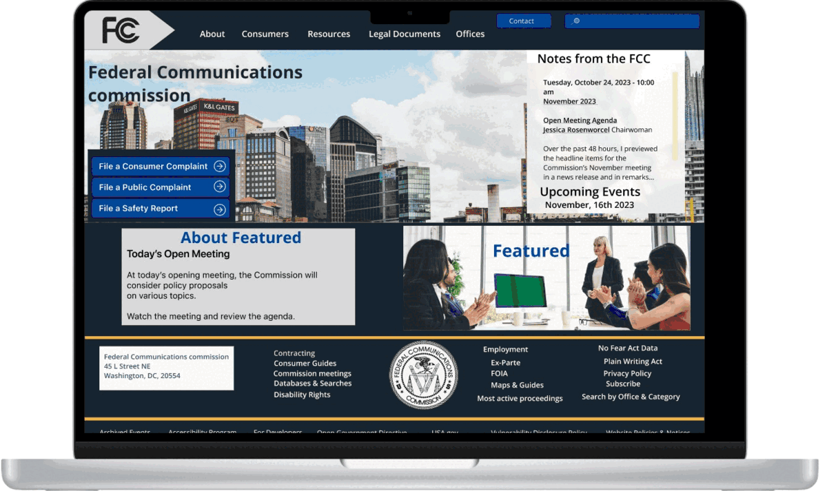
We redesigned the website using the style guide, ensuring that colors and fonts were consistent. We then tested the website thoroughly and ensured it met the AA criteria. After that, we tested both the prototyped website and the mobile version.

Usability & Testing
The objective of website testing is to assess its usability and identify any potential issues that may hinder its effectiveness. The ultimate goal is to ensure that the website provides seamless access to the desired information and offers adequate assistance to the users.
The purpose of testing is to uncover any potential design flaws and come up with new and efficient ideas that can enhance the user experience.
The target audience for this testing is individuals aged between 20 and 40 years.
The testing will be conducted remotely using Zoom and Google Meet.
The tasks we assigned were:
-
File a Complaint with the FCC regarding issues concerning the consumers.
-
I would like to know if the User can contact the FCC to apply for licenses and other permissions.
-
I would like to know if the User can subscribe to FCC's newsletter.

Key findings
-
86% were able to find the contact FCC button without an issue.
-
71% found the Contact FCC link without any problems.
-
86% found the link to subscribe to the FCC newsletter.


Conclusion & Future Opportunities
I found redesigning a government website challenging yet enriching. As I delved deeper into the project by creating high-fidelity designs, I began to feel more confident in my abilities. Although the heuristic evaluation and annotations presented some initial challenges, I found producing them increasingly satisfying as I honed my skills. Despite difficulties establishing the right mood and style for a government website, I am incredibly proud of the clean, professional, and engaging web page I created.