

Room Finder App
Overview
Living with a roommate is exciting but can be challenging. We developed a Roommate Finder app to help people find suitable roommates. Our process involved extensive research, design thinking, problem identification, solution development, interviews and surveys, impact analysis, and ideation.
My Role
-
User research
-
User interviewer
-
Sketching and Wireframing
-
UI Design
-
Low-Fidelity prototype using Figma
-
High-Fidelity prototype using Figma
-
User testing
Timeline
3-weeks
Platform
Mobile, iOS
Problem, Solution, Impact
Problem
People have yet to find an app that would allow them to find reliable, safe roommates, which would help them avoid headaches and save money.
Solution
Create a community app that allows young professionals and college students to find roommates they feel will be compatible.
Impact
We propose an app for young adults to find compatible roommates. It will have a user-friendly platform to create profiles, search for roommates, and communicate securely. Group chats, background checks, and a budget tab will also be included.
How Might We?
How might we launch ruM8 to increase user satisfaction, improve user registrations, and geometric tracking to help determine future marketing campaigns?
Let's Begin!!
I followed a proven UX process in top frameworks to create a user-friendly product. I learned and implemented this process as a designer in all my projects. Below is the design process I use to solve problems effectively.

User Research
I researched the problem space before user research. We set objectives to see if young professionals or college students need a roommate-finding tool to help them find compatible roommates and save money.

Hypothesis
People want an app that allows them to find reliable, safe roommates that help them avoid headaches and save money.
Methodology
The User survey was conducted as the first step in collecting closed-ended questions. It was sent out via Google Forms.
The objectives are to:
-
Understand what living accommodations users need based on employment or accessibility.
-
Gain insight into the roommate selection process by assessing past experiences.
-
Discover how participants felt after their roommate experience.
Some of the questions we asked are listed below:
-
How important is it to you to find affordable accommodation?
-
Is it essential to find a roommate with a compatible lifestyle?
-
What were some of the pain points of past roommates?
-
Did they discover anything during their experience that could be applied in the current search?
-
Do you look for roommates to budget for housing or more social reasons?
-
What was the process in vetting possible roommates?
Here are some insights based on the questionnaire hypothesis.

We conducted 15 to 20-minute Zoom interviews and recorded and transcribed them to understand participants' preferences and needs.

Empathy Map
We categorized the interview feedback based on what users think, feel, say, and do to understand their needs and pain points better.

Affinity Diagram
We used an affinity diagram to analyze interview responses and feedback, identify patterns, and make informed decisions.


Key findings from Affinity Diagram
-
Participants had some qualifications in their roommate search/journey.
-
They were seeking someone with a compatible schedule
-
They needed a roommate to accommodate their lifestyle.
-
Pet-Friendly
-
Organized
-
Had Common Values/Interests.
-
Negative experiences taught participants what to look for now.
Define
Research helped us develop user insights, which led to a better understanding of our target audience's needs and preferences. This allowed us to create a more user-friendly product, which increased customer satisfaction and loyalty and improved sales and market share.
User Insight
A busy college student who just started a job and is in classes needs a quick way to find affordable housing with a responsible roommate because the cost of dorms is not feasible.
User Persona
We created persona Kasey to design the product for their needs.

Competitor Analysis
To help Kasey, our User persona, find an app that would help her find a roommate and room while keeping track of her budget; we analyzed our competitors. We categorized them into Direct (Roomster, Roomies, Spareroom) and Indirect (Facebook, Craig's List) competitors.

Based on our analysis, I examined the strengths, weaknesses, opportunities, and threats and identified what helps the Rum8 Roomfinder app stand out.

Ideation
Ideation is crucial in generating new and innovative ideas during design thinking. This phase helped us challenge assumptions and preconceived notions, think beyond conventional boundaries, and explore uncharted territories. It involved brainstorming, idea generation, and rapid prototyping to iterate and refine ideas quickly. For this step, we interviewed people to learn about their preferences, desires, and hypothetical scenarios to gather further ideas.
What the Users Likes?

What the Users wish they could have in the app.

The Users What ifs- this was a creative part of the ideation. It helped us to think outside the box.

We examined the requirements and user feedback, prioritized the most critical features, and created a roadmap for timely implementation. This approach helped us deliver a functional and user-friendly product that met our target audience's needs and expectations.

User Journey
We grouped feedback based on user preferences. I used personas to map the user journey, divided it into stages, and identified touchpoints. I spotted opportunities considering users' emotions, thoughts, and actions.

Planning
I gathered user research insights and created task flows to identify pain points. Then, I constructed a sitemap to give structure to the app.


Prototyping (low-hi)
I created many sketches on paper during the app's design process to connect its information architecture to its visual design. I created wireframes to establish a clear and consistent way of displaying specific types of information on the interface. This helped me ensure that all the necessary information was included in the design and presented logically and easily.
Brainstorming — laid out all the key pointers in one place to keep in mind whilst getting into wireframing.

I wanted to validate my search flow, and to get that done, I conducted usability testing on the hi-fi wireframes. Usability testing was conducted via interviews over Zoom with the help of a prototyped version of wireframes. Below are the critical task flows based on which usability testing was made:
Tasks
-
Length of profile completion and verification
-
How did users determine if their matches were compatible based on the profiles they created?
-
The difficulty of checking and adding items to a budget
The feedback that was gathered from the tests are as follows:
Task 1:
-
Too much on the first screen
-
Reduce the number of steps in the verification
-
Fix margins on the profile page
Task 2:
-
Fix spacing of header transition from profile to messages
-
Too much information on the profile page
-
Confusion about the home page (her profile or someone else’s?)
-
Pictures and social media are clear
Task 3:
-
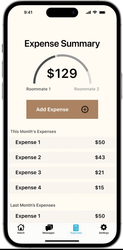
The visual graph of expenses looks good
-
The flow is really strong and clear

Key findings after testing
-
Rework Profile Screen.
-
New logos
-
Rework copy to avoid similarities to dating sites.
-
Rework messaging so you have to match with users' profiles before they can message.
-
Reworked coaching page so user can tap next instead of swipe
So, we had to go back and iterate the designs to make them user-friendly before adding the UI.

The onboarding had to change to make it easier for the users to sign in. It was split into sign up, sign in, and create an account.

The auto split feature was added in the iteration process.

The auto split feature was added in the iteration process.

New buttons were introduced during the iterations to make it easier for the users.
Typeface
During iterations, I started looking into colors and fonts that complement each other. Out of all the colors that I glanced at, I liked the ones below. After playing with the combinations, I decided to interchange the background and the font colors.

The font that was used was SF Pro for the iPhone mobile app.
The icons that was used are:

The images that were used are:

User Testing + Outcomes
We conducted seven user tests. All of the participants were 18 and older. We had them run through three tasks. Our first task aimed to identify how long it takes them to create and verify their account. Our second task aimed to assess how users could determine whether their matches were compatible based on their built profile. Our final task aimed to determine how seamless the process was for users to check and add items to their budget.


Conclusion + Future Opportunities
Enhance visibility of compatibility with other users. Add profile sections to emphasize housing preferences. Enhance visibility and features of confirmed roommates. We want to make it easier for our users to find compatible roommates and housing options. Users can highlight what they seek in a living situation by adding profile sections specifically for housing preferences. This will help match users with similar preferences and increase the likelihood of finding a compatible roommate.
Learnings from the project
-
Learned how to work within a defined time constraint of 4–5 days and make trade-offs in the design process.
-
As someone who's been through the hassle of house hunting multiple times, I also learned about other people's struggles. The user interviews were full of insights, and I could compare my house-hunting process with others, pointing out the similarities and differences.
-
Competitive analysis helps identify the gaps in existing platforms in the market so that the solution you're working on tries to cover all the gaps.
-
Desk research provides the "Who, what, where, and when" data, whereas primary user research provides the "how and why" behind every user decision.
-
Designers often assume user behavior with the product and its usage. This may occasionally lead us in the right direction, but the effectiveness of these decisions can't match the level of decisions taken based on accurate, actual data.
Future Steps
-
Improve visibility of compatibility with other users
-
Additional profile sections to focus more on housing preferences
-
Improve visibility and features of confirmed roommates